5 Principles of UX Design

Won’t you be overjoyed when you see users happy using your design just as the picture above? Yes, of course, you will be.
Making users smiling and surprised — is the most cherished dream of every designer.
If you are a designer then I have a question for you — Have you ever designed anything without cherishing the dream told above? You didn’t do, did you? Now the fact is that every designer wants to make the user happy but most of them don’t know how to do it. And here comes the UX design concept.
What is UX Design?
UX Design relates to the user’s feelings and product developments. UX stands for User Experience. When a user uses a product, he/she may experience a good or a bad or both feeling about the product. A UX designer’s job is to research on the users and figure out what side of design is bothering the users and how to fix it.
In general, User Experience is simply how people feel when they use a product or service — Interaction Design Foundation (IDF)
UX design leads to maximize user’s satisfaction on a product. And that’s why it is so important in designing. A design may be good looking, but, if users are bothered by this design, then the design must be changed. And these changes should be done in a process that is defined by the UX Design department of the company.
Principles of UX Design
UX design relates to the development of any kind of product, although it is mainly used in the development of computer-based products such as websites, apps, software, etc. There are a bunch of important principles that should be followed by every UX designer. I will talk about the five most important principles among them. They are:
- Design for your users, not for yourself
- Feedback
- Digestibility
- Clarity
- Familiarity Let’s kick it off.
#1 Design for your users, not for yourself
Most of the designers tend to design product considering himself/herself the only user of the product.
For example: suppose you can read 700 words per minute. But, in general, people can read 200 to 250 words per minute. If you are designing a slider/carousel where a bunch of words is being shown and changing the carousel within a short duration, a problem will occur. And that is most of the readers can’t read all the words though you can still read (because of your speed reading capability). But you are losing your users for this bad UX. From the example below, you will get a clear understanding of this problem.
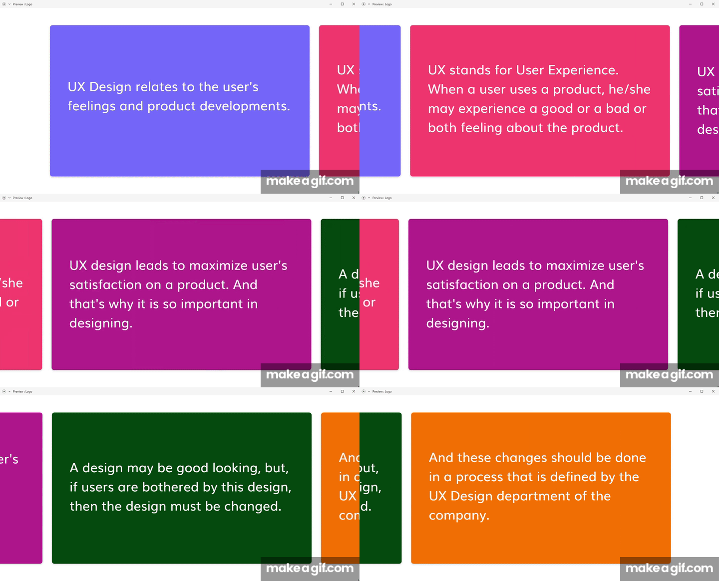

Another example can be the color of the t-shirt. You like purple color a lot. That’s why you have chosen a purple t-shirt for design. But the maximum people in the world like a black t-shirt. In that case, you may lose a big market because of color.
And for that reason, at the time of designing, you have to think about what your users want in your design and what will make them smiling.
#2 Feedback (Confirmation of Users’ Actions)
As you are reading this article using pc/mobile phone, you are a digital user for sure. Every day we all have to press so many buttons on websites, apps, etc. virtually as a digital user. Now see, these buttons have no physical existence but we feel like pressing real buttons when we press them. Why does this happen? Can you tell me?
I can guess most of you guys have guessed the correct answer. Yes, the answer is the response of these buttons after pressing. And this response is called feedback.
Think about one of your friends to whom you are talking for a long time, but he has no response. Have you ever faced this type of situation? I’ve faced a lot. And it was so disgusting. Now question to yourself, what will you do in this situation. Yes, most of the people will stop talking and look for another person to talk or just leave the place.
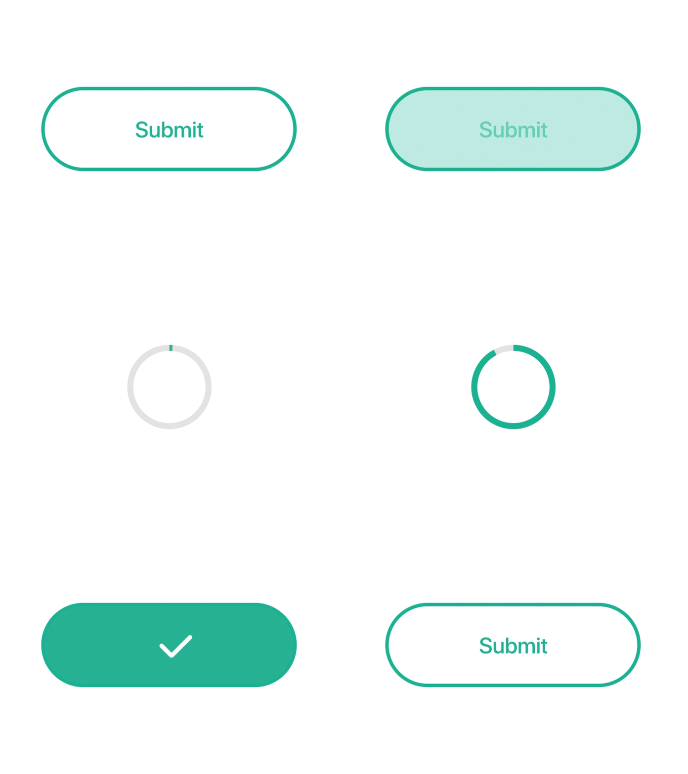
Design by Victor Wang on Dribbble
This is the same scenario that happens with your design. If there is no response to the user’s actions (feedback), they’ll just leave it and look for an alternative. So feedback is an essential feature in designing. That means when a button or something will be pressed, it must response to the user’s action like the picture above. This response can be made by using ripple effect, color/size transition, animation, etc.
#3 Digestibility (Don’t Let Your User Down with Long Piece of Content)
Suppose you’re given a piece of apple and asked to swallow it without chewing. Can you do that? In general, the answer is obviously “No”. Because our stomach can’t digest large pieces of food. That’s why we chew to divide food into very small pieces so that our stomach can easily digest it.
The same thing also happens with our design. When we design a so long content/ element/ component, it may bother other users. For that, we need to divide large content into small pieces.
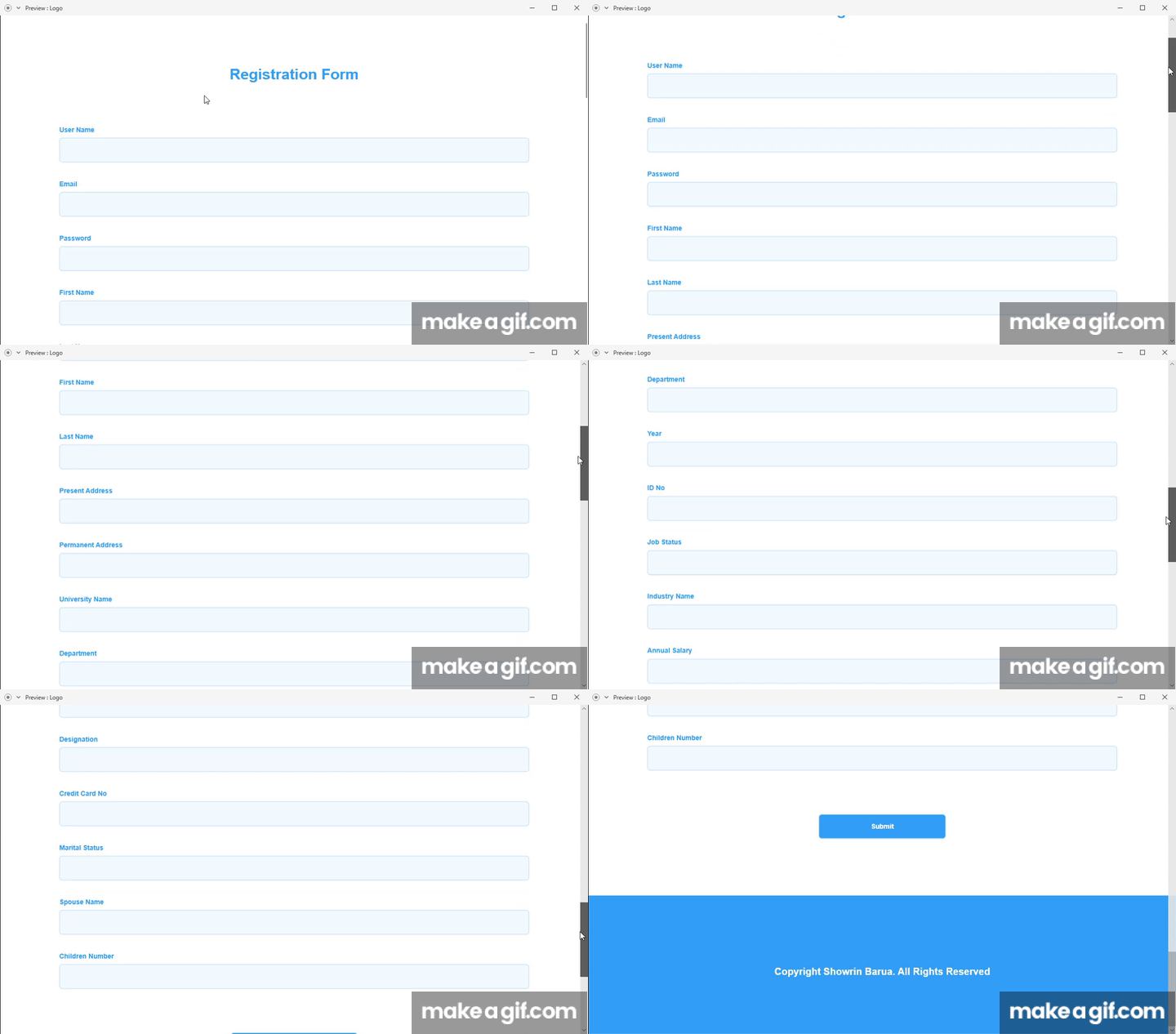
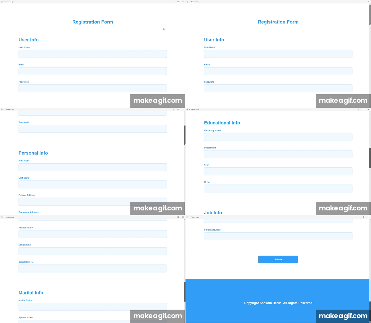
For example, The first picture is showing a large form asking a lot of information to users. According to UX Design, it is strictly prohibited to ask users a lot of unnecessary information. But for the sake of argument, let assume, Infos that are asked in the first form, all are needed. Now we can’t reduce this large form (like a large chicken-roast). What we can do is to divide this large piece of chicken-roast into smaller pieces so that our brain could not be frustrated seeing the large piece. And that’s actually what is shown in the second picture. Using the second form, most of the users would not be bored.
#4 Clarity (Don’t Make Users Think)
It is assumed as the most prioritized principle in UX Design. Designers are asked to make their design as clear as possible so that users could not get confused. If your users get confused, your design will receive a bad response from them.
As a user, I should never have to devote a millisecond of thought to whether things are clickable or not — Steve Krug


Here, in the first picture, we can see that there is a “GET STARTED FOR FREE” button. When the button is clicked, it redirects users to a page where credit card information is asked with personal info. But the problem is all of your users might not have a credit card. For them, clicking the “GET STARTED FOR FREE” button is just wasting of time. It also creates a bad impression on your design. But if you told your users that it needs a credit card, users not having a credit card could save their time. Now according to this principle, we can say the second picture is a good one.
#5 Familiarity (Make Your Design Using Familiar Things)
You could say it as the extension of the principle of clarity. Creativity in UX design is always cordially invited but if it creates confusion for users, it should be aborted.
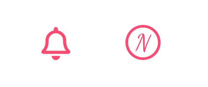
In the picture above, we can see two different icons and both are being used to represent notification. But people are used to seeing a bell as a notification icon. That’s why the second icon (N inside a circle) can make users confused. For so we should use a bell icon to represent notification. But if you use something different, then you should make the icon in such a way that its meaning becomes clear to users.
The Take-Away
As a UX Designer, you should create a design based on users’ needs. And you should also create a design that will not bother or disappoint your users. For so you’ll have to follow some principles, They are:
-
Design for your users, not for yourself.
-
Give your users a Feedback after their action.
-
To make your users happy, break a large piece of content into small pieces.
-
Make sure that the meaning of your design is clear to all of your users.
-
Use familiar icons or elements in your design as far as possible.
Conclusion
UX Design does not mean telling users what you can create, but rather telling that what you have created for them is easy to use for them. In this modern era, all productions have to follow a user-centric product design. Feeling users’ emotions and make a design that can create an emotional attachment with users are two required qualities for a UX Designer. So feel emotions, build emotions and spread emotions by design.
If you find this article useful and like it, feel free to share it so more people can take benefit from it. You can connect with me and discuss this article on LinkedIn or my website.